
Palette
I formerly used what we called a chromatic palette, sometimes derided as a candy palette. It’s loaded with strong, brilliant pigments like cad orange and red, at least two shades of cad yellow, a strong purple like Old Holland’s Schevenings Violet, ultramarine blue, etc. It teaches you to use primaries to make secondary colors and to neutralize, but I was unable to neutralize it enough to convince my eyes. As in some other things, it took me too long to accept that I had to change.
Over the past few years I have gradually shifted to a palette that relies on earth colors for its basic mixtures while retaining smaller amounts of the cadmiums for tinting. I have discontinued use of Schevenings Violet for the time being. I may take it up again as a tinting color someday. I will not use it again as a basis for dark notes because I don’t feel I can neutralize it sufficiently. In other words, it is too strong a shade of purple. My current palette is: titanium white, cad yellow medium, cad yellow light, yellow ochre, ultramarine blue, ivory black, cad orange, cad red, light red (Windsor Newton’s variety), caput mortuum violet and burnt umber. I keep thalo blue on hand for rarely needed tinting, and chromium oxide green because it makes a good middle range neutral in certain conditions when combined with a red or a violet or umber. Ultramarine blue with cad orange and lots of white makes a very versatile light to medium gray that can be shifted from warm to cool without adding other pigments. I still find that the greens of summer in strong sunlight require substantial doses of the cad yellows to look true. I mix all of my greens with yellows and ultramarine or ivory black as a base. Bear in mind that a green can be anything from the chartreuse shade of a newly budded leaf to a smoky shadow on a dull day, deep in some cedar in winter. Cad red is almost always on the palette in a small amount, but often I don’t use it at all, and when I do I use it very sparingly to spike a warm note somewhere or to hit a shade of some autumn or winter variety of color. Just the right amount of it is sometimes admirable for warming up a dark neutral note without making it rusty brown or purple. I don’t think it mixes with white very well for high key warm notes in most landscape painting applications.
These days I am using mostly Blockx and Sennelier pigments. They are ground in lighter oils that keep the working surface open a little longer and they have the buttery consistency that I generally like. Most of my paintings are completed in one session. Since I am not building paintings up in layers of wet over dry, I am not too concerned about the softness of, for example, poppy seed oil in comparison to something like cold pressed linseed oil. The old adage is that simple, direct painting makes the most durable surface. I have no doubt that cold pressed linseed oil makes a superior durable paint film. But I think that many impressionist paintings made in the nineteenth century with pigments ground in poppy seed oil and painted simply and directly have also proved to age well.
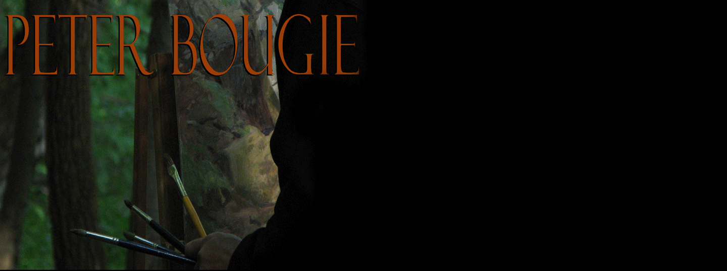
The photo above is by Nora, taken in December of 2008 at Kinnickinnic State Park, as I worked on the painting Park Road.

No comments:
Post a Comment